
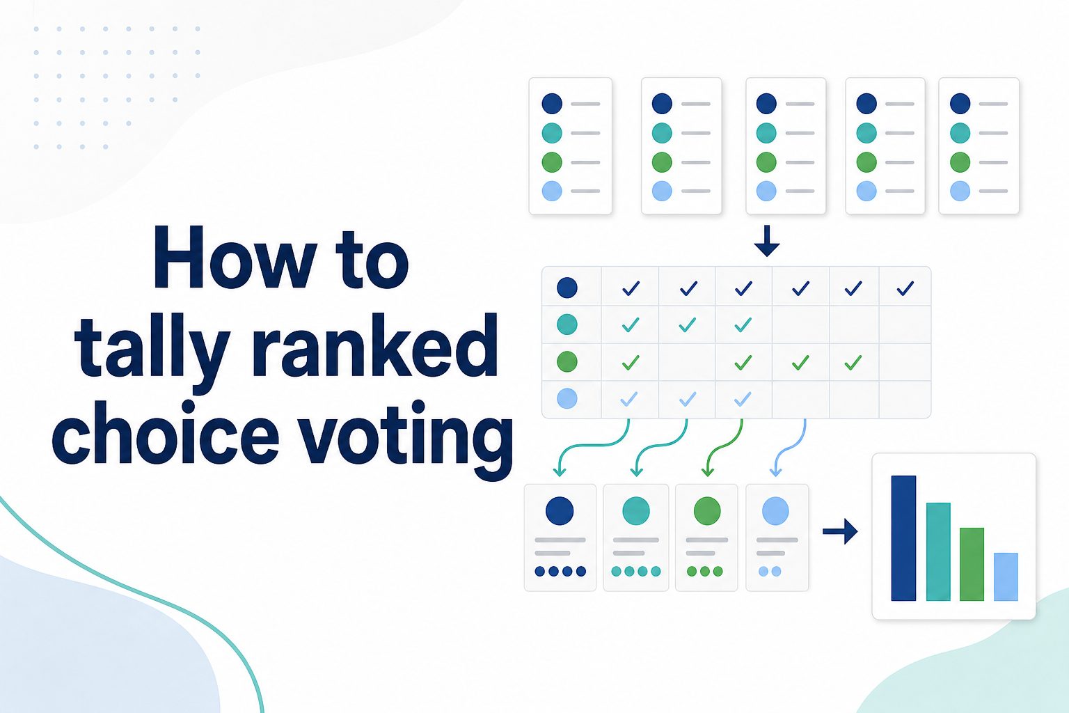
If you are wondering how do you make a tally chart in google sheets, the short answer is that you can build one with a simple table, grouped counts, formulas, and a clear visual layout. A tally chart helps you count repeated items, survey answers, classroom results, inventory checks, attendance records, or any data where you need to track frequency. Google Sheets does not have a dedicated “tally chart” button, but it gives you several easy ways to create one manually or automatically. In this guide, you will learn what a tally chart means, why it is useful, how to prepare your data, how to make tally marks, how to use formulas, how to avoid common mistakes, and how to make your sheet easier to read and update.
What A Tally Chart In Google Sheets Means
A tally chart is a counting table that records how often something happens. In Google Sheets, it usually includes categories in one column, tally marks in another column, and final totals in a third column. This makes raw counts easier to scan, compare, and explain.
Traditional tally marks are grouped in sets of five. The first four marks are written separately, and the fifth mark crosses the group. In a spreadsheet, you can represent this with vertical bars, grouped symbols, numbers, or formulas that calculate the total for each item.
The main value of a tally chart is simplicity. Instead of reading through a long list of repeated names, choices, or observations, readers can quickly see which category appears most often and which appears least often.
Google Sheets is especially useful because you can update the data, sort the totals, add charts, share the sheet, and collaborate with others in real time without rebuilding the tally table from scratch.
A tally chart is not only for school assignments. It is also practical for business reporting, event planning, quality checks, customer feedback, sports tracking, and household organization.
Why Tally Charts Work Well In Google Sheets
Tally charts work well in Google Sheets because they combine simple counting with spreadsheet flexibility. You can start with a manual layout, then add formulas, filters, formatting, and charts as your data grows.
- Easy Counting: A tally chart turns repeated observations into neat counts, making it easier to summarize data without reading every row again.
- Clear Comparison: Totals beside each category help readers compare answers, items, or events quickly and accurately.
- Fast Updates: When formulas are used, totals can update automatically as new responses or records are added.
- Simple Sharing: Google Sheets makes it easy to share a tally chart with classmates, coworkers, teams, or clients.
- Flexible Formatting: You can use borders, colors, bold labels, and conditional formatting to make the tally chart easier to read.
Prepare Your Data For A Google Sheets Tally Chart
Before making the tally chart, organize the information you want to count. Clean data saves time and prevents wrong totals, especially when your source list includes repeated entries, spelling differences, or blank cells.
1. Choose The Categories To Count
Start by deciding what each tally row should represent. Your categories might be fruit names, survey choices, product defects, attendance reasons, or customer ratings. Keeping categories clear and separate helps Google Sheets count accurately and prevents similar items from being mixed together by mistake.
2. Place Raw Data In One Column
If you are using formulas, put the original responses or observations in a single column. For example, survey answers can go in column A, with one answer per row. This structure makes it easier to use counting formulas and reduces confusion when you update the sheet later.
3. Remove Empty Or Unclear Entries
Blank cells, misspelled answers, and unclear labels can create inaccurate results. Review the source data before building the tally chart. If one person writes “Yes” and another writes “yes,” decide on one consistent version so the final count reflects the real total.
4. Create A Separate Summary Table
Use a clean area of the sheet for your tally chart instead of mixing it into the raw data. A summary table usually includes category names, tally marks, and totals. This separation makes the chart easier to read and keeps your original data available for checking.
5. Decide Between Manual And Formula Counting
Manual tally marks are useful for small tasks or classroom activities, while formulas are better for larger or changing data sets. If your list may grow over time, use formulas from the start so your tally chart can update without extra manual work.
6. Add Clear Column Headings
Good headings make the tally chart easier for others to understand. Use labels such as “Category,” “Tally,” and “Total.” Clear headings also help if you later turn the table into a bar chart, sort the results, or share the sheet with someone else.
Make A Tally Chart In Google Sheets Step By Step
This basic process works for most tally charts, whether you are tracking survey answers, classroom votes, inventory counts, or repeated items in a list.
- Open Your Sheet: Create a new Google Sheets file or open the sheet that contains your data.
- Add Your Categories: In a blank area, list each category you want to count in the first column.
- Add A Tally Column: Use the next column for tally marks, grouped symbols, or a formula-generated tally display.
- Add A Total Column: Use a third column to show the final number for each category.
- Count Each Category: Enter totals manually or use a counting formula based on your raw data column.
- Format The Table: Add borders, bold headings, and spacing so the tally chart is easy to scan.
- Review The Results: Check the totals against the source data to make sure every item was counted correctly.
- Update As Needed: Add new rows, refresh formulas, or sort the totals when new data comes in.
Manual Tally Marks In Google Sheets
Manual tally marks are the simplest method when you want the chart to look like a classic tally table. This approach is best for small counts, demonstrations, quick observations, and situations where visual counting matters more than automation.
1. Use Vertical Bars For Marks
You can type vertical bars in the tally column to represent individual marks. For example, four marks can appear as four bars beside a category. This is easy to create, but it works best when the number of marks is small and easy to count visually.
2. Group Tallies In Sets Of Five
Traditional tally charts are easier to read when marks are grouped by five. In Google Sheets, you can separate groups with spaces, such as five marks followed by another group. This helps readers count faster without mentally adding every single symbol one by one.
3. Keep A Numeric Total Beside Marks
Even if you use visual tally marks, include a total column. The total prevents misreading, especially when there are many marks in one row. It also helps if you want to sort the tally chart or turn the data into another chart later.
4. Use Monospaced Alignment Carefully
Google Sheets cells may not always align symbols perfectly, especially if the font varies. Choose a simple font and keep the tally marks in one column. Consistent alignment makes the tally chart look cleaner and reduces the chance of miscounting grouped marks.
5. Avoid Overloading One Cell
If one category has a very large count, manual tally marks can become hard to read. In that case, use a numeric total or formula-generated groups instead. A tally chart should simplify counting, so switch methods when the visual marks become too crowded.
6. Use Manual Tallies For Teaching
Manual tally charts are useful when teaching data collection because they show how counting develops from observation to total. Students or beginners can see the connection between each event and the final number before learning more advanced spreadsheet formulas.
Formula Based Tally Charts In Google Sheets
Formula-based tally charts are better when you already have raw data in a column. They reduce manual counting errors and update automatically when new entries are added to the source list.
1. Use Countif For Single Categories
The most common formula for a tally chart is COUNTIF. It counts how many times a specific category appears in your data range. For example, if your raw responses are in one column, COUNTIF can calculate the total for each listed category automatically.
2. Use Unique For Category Lists
If you do not want to type every category manually, UNIQUE can create a list of distinct entries from your raw data. This is useful when survey answers, product names, or repeated labels appear many times and you need a clean summary table.
3. Combine Unique And Countif
A strong formula setup uses UNIQUE to create the category list and COUNTIF to calculate totals beside it. This gives you a dynamic tally chart that expands as new categories appear, making it more reliable than a fully manual table.
4. Use Rept For Visual Tallies
The REPT function can repeat a symbol based on a number. For example, it can display repeated bars according to the total count. This lets you create a visual tally effect while still relying on formulas for accuracy and easy updates.
5. Use Query For Larger Data
When your data set is larger, QUERY can group items and count them in one formula. This is helpful for reports where you need a compact summary from hundreds or thousands of rows without manually building a separate category list.
6. Check Formula Ranges
Formula errors often happen because the selected range is too short, too wide, or missing new rows. Use a consistent source range and check it after adding data. Accurate ranges are essential for a tally chart that updates correctly over time.
Examples Of Tally Charts In Google Sheets
Examples make the process easier to picture. The best tally chart format depends on what you are counting, how often the data changes, and who needs to read the results.
1. Survey Answer Tally Chart
A survey tally chart can count answers such as “Yes,” “No,” and “Maybe.” Put the raw responses in one column, list each answer in the summary table, and use formulas to count them. This gives a quick view of group opinion.
2. Classroom Vote Tally Chart
Teachers can use a tally chart to count votes for activities, book choices, lunch options, or project topics. Manual marks work well when students are learning basic data skills, while totals help the class compare results after voting ends.
3. Inventory Count Tally Chart
For inventory, a tally chart can count how many times each item appears during a stock check. This is useful for small storerooms, classroom supplies, office materials, or event equipment where a simple count is enough for decision-making.
4. Attendance Reason Tally Chart
An attendance tally chart can summarize reasons such as vacation, illness, late arrival, or remote work. By counting repeated reasons, a manager or coordinator can notice patterns without reading through every individual note in the sheet.
5. Quality Control Tally Chart
Businesses can use tally charts to count defect types, support issues, or inspection results. A simple frequency table helps teams see recurring problems and decide which issue deserves attention first, especially when totals are reviewed regularly.
6. Event Preference Tally Chart
Event planners can tally meal choices, session preferences, seating requests, or availability responses. A Google Sheets tally chart keeps the planning data organized and makes it easier to share final counts with vendors, staff, or team members.
Common Tally Chart Mistakes To Avoid
A tally chart looks simple, but small setup errors can produce confusing or inaccurate results. Avoid these common problems when building your chart in Google Sheets.
1. Mixing Raw Data And Summary Data
Putting raw entries and tally results in the same area can make the sheet difficult to maintain. Keep the original list separate from the summary table so you can check the source data, update formulas, and avoid accidentally overwriting important entries.
2. Counting Similar Labels Separately
Google Sheets treats slightly different labels as different values. “Apple,” “apple,” and “Apples” may be counted separately unless cleaned first. Standardize labels before counting so the tally chart reflects the real category total instead of scattered duplicates.
3. Forgetting To Include New Rows
If your formula range stops before the newest data, the tally chart will show incomplete totals. This is a common issue when people add responses below the original range. Check your formulas after expanding the source list.
4. Relying Only On Visual Marks
Visual tally marks are helpful, but they can be misread when counts become large. Always include a numeric total for clarity. The number gives readers a reliable answer, while the marks provide a quick visual cue.
5. Using Too Many Colors
Color can improve readability, but too many colors make a tally chart harder to scan. Use color mainly for headings, totals, or important differences. A clean chart is usually more useful than a heavily decorated one.
6. Skipping A Final Accuracy Check
Before sharing the tally chart, compare a few totals against the raw data. This quick review catches spelling issues, formula mistakes, and missing rows. A simple check can prevent wrong conclusions from spreading through a report or presentation.
Best Practices For Google Sheets Tally Charts
Good tally charts are accurate, readable, and easy to update. These best practices help you create a chart that works well for both quick counting and longer-term reporting.
1. Keep The Layout Simple
Use a small number of clear columns, usually category, tally, and total. A simple layout helps readers understand the chart immediately. Extra columns should only be added when they serve a real purpose, such as notes or percentages.
2. Use Formulas For Changing Data
If your data will keep growing, formulas are usually the better choice. They save time and reduce mistakes because totals update when new entries are added. Manual counting is best reserved for small, fixed, or instructional data sets.
3. Add Borders Around The Table
Borders help separate headings, categories, tally marks, and totals. This is especially useful when the sheet has other information nearby. A few clean borders can make the tally chart look organized without making it visually heavy.
4. Sort By Total When Needed
Sorting the tally chart by total can reveal the most common and least common categories quickly. This is helpful for surveys, defect tracking, and decision-making because readers can focus on the most important results first.
5. Freeze Headings In Larger Sheets
If your sheet has many rows, freeze the heading row so labels stay visible while scrolling. This small formatting step makes the tally chart easier to use, especially when several people are reviewing or updating the same file.
6. Pair Tallies With A Simple Chart
After building the tally table, you can add a bar chart or column chart for presentation. The tally table gives exact values, while the visual chart helps readers compare categories quickly during meetings, lessons, or reports.
Advanced Google Sheets Tally Chart Tips
Once you know the basics, advanced techniques can make your tally chart more useful, cleaner, and easier to maintain across larger or more active sheets.
1. Add Percentages Beside Totals
A percentage column can show each category’s share of the total. This is useful when the count alone does not tell the full story. For example, twenty votes may be impressive or small depending on the total number of responses.
2. Use Data Validation For Inputs
Data validation helps prevent spelling variations by limiting entries to approved choices. This is especially useful for team sheets, surveys, and logs. When people choose from a dropdown, formulas count categories more accurately and the tally chart stays cleaner.
3. Apply Conditional Formatting
Conditional formatting can highlight high totals, low totals, or important thresholds. For example, the highest count can appear in a stronger color. This helps readers notice patterns quickly without manually comparing every number in the table.
4. Add A Timestamp Column
If your tally chart tracks ongoing activity, timestamps can show when each entry was recorded. This makes the data easier to audit and can help you compare counts by day, week, or event period when needed.
5. Protect Formula Cells
When other people use the sheet, protect cells that contain formulas. This prevents accidental edits that could break the tally chart. Keeping input cells open and formula cells protected is a practical way to support collaboration.
6. Create A Chart From Totals
A bar chart built from the category and total columns can make the tally results easier to present. Use the tally chart as the accurate data source and the visual chart as a quick summary for people who prefer comparison at a glance.
When To Use A Tally Chart In Google Sheets
A tally chart is useful when you need a simple frequency count, but it is not the best format for every kind of spreadsheet analysis.
Use It For Repeated Categories: Tally charts are ideal when the same values appear again and again, such as survey choices, names, items, votes, or issue types. The chart turns repetition into a readable summary.
Use It For Quick Decisions: When you need to know which option received the most responses, a tally chart is fast and clear. It supports decisions without requiring complex analysis or advanced spreadsheet skills.
Use It For Teaching Data: Tally charts are excellent for explaining frequency, counting, grouping, and totals. They are simple enough for beginners while still connecting naturally to spreadsheet formulas.
Avoid It For Complex Metrics: If you need averages, trends, forecasts, or relationships between many variables, a tally chart may be too basic. In those cases, pivot tables, dashboards, or statistical formulas may work better.
Avoid It For Unclean Data: If your source data contains inconsistent labels, missing values, or mixed formats, clean it before counting. A tally chart is only as reliable as the data behind it.
Use It With Visual Charts: For presentations, pair your tally table with a bar chart. This gives readers both exact numbers and a quick visual comparison without making the spreadsheet harder to use.
Review It Before Sharing: A tally chart is often used to summarize decisions, so accuracy matters. Check formulas, category names, and totals before sending the sheet to others.
Tally Chart Checklist For Google Sheets
Use this checklist before you finish your tally chart. It helps make sure the chart is accurate, readable, and ready to share.
- Clear Categories: Confirm that each category is named consistently and does not duplicate another category with different spelling.
- Separate Summary Table: Keep the tally chart separate from the raw data so the sheet remains easy to edit and review.
- Accurate Totals: Check formulas or manual counts against the source data before relying on the results.
- Readable Formatting: Use headings, borders, and spacing so readers can scan the chart without confusion.
- Update Plan: Decide whether the chart will be updated manually or automatically as new data is added.
Frequently Asked Questions
Can You Make A Tally Chart In Google Sheets Without Formulas
Yes, you can make a tally chart without formulas by typing categories, adding tally marks manually, and entering totals yourself. This works well for small counts, classroom activities, or quick observations, but formulas are better when the data changes often.
What Formula Counts Items For A Tally Chart
The most common formula is COUNTIF because it counts how many times a specific value appears in a selected range. You can use it beside each category in your tally chart to calculate totals automatically from a raw data column.
Can Google Sheets Create Tally Marks Automatically
Google Sheets can create a tally-style display with the REPT function, which repeats a chosen symbol based on a number. This gives you visual marks while still using formulas for the actual count, making the chart easier to update.
Is A Tally Chart The Same As A Bar Chart
No, a tally chart counts and summarizes frequency in a table, while a bar chart displays those totals visually. They work well together because the tally chart gives exact counts and the bar chart makes comparison easier to see.
What Is The Best Layout For A Tally Chart
The best layout usually has three columns: category, tally, and total. This keeps the chart simple, readable, and easy to update. You can add optional columns for percentages, notes, or dates if they make the chart more useful.
Why Are My Tally Chart Totals Wrong
Wrong totals usually come from inconsistent labels, blank cells, incorrect formula ranges, or new rows that were not included in the count. Review the raw data, standardize category names, and check each formula range before sharing the results.
Conclusion
Making a tally chart in Google Sheets is a practical way to count repeated items, organize simple data, and present results clearly. You can build one manually with tally marks or use formulas like COUNTIF, UNIQUE, and REPT for a cleaner automated setup.
The best method depends on your data size and purpose. Use manual tallies for small or educational tasks, formulas for changing data, and simple formatting to keep the chart easy to read, update, and share.